Wednesday, June 25, 2008

Precis [05]


So we had to hand render 5 perspectives to better show the details within our space.  I had so much trouble at first because I really didn't know what colors to do and I had just changed the entire space.  I spent the weekend remodeling and rethinking and YES REDESIGNING the entire interior.  It needed it...trust me.  Fashion is to dramatic for my space to have been so stagnant.   Designing is just an on going process.  You lay things out then look at it and push the design further.  I love the process.  Take a look at it now.  Don't worry I am still in the process of "pushing the design" but it feels like the space is coming together.


Monday, June 23, 2008

some ideas

So I am obsessed with the idea of a totally white and gray space for my design BUT get this with elements of shine, reflectance, and glamor.  I want the space to be a clean palette with a sense of awe.  You know one of those spaces where the architecture and materials make you want to explore the space.  
So with that thought in your mind here are some ideas I found while reading some of my favorite blog sites (which by that way...I love to do when I need some inspiration):
24kips06500

This is a ceiling by Philip Gorrivan.  It is stretch vinyl that looks like lacquer but cost a lot less.  I enjoy the simple qualities of it.  What a beautiful touch!!
Bouquetchair1

This is just a fun chair by Tokujin Yoshioka.  It is a stunning exhibit of two design mediums joining together (flower design and product design).  It reminds me of a garment for your chair.  I love the blend of colors.


See white can be stunning with a mix of textures. 
0
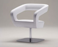
I love the shape of this simple chair from desginer pages.


new design in the works


I am in the middle of redesigning my space.  I had a review with some of my brilliant peers and now I am completely inspired.  I spent the last 24 hours straight designing in CAD and Sketchup.  I don't know what came over me but I was obsessed...to be honest.  It is not even all that much done for all the time I put into it.  Maybe because I was watching a movie while working on it.  


Precis [04] codes


This a just a couple important things to think about.  I actually changed my whole design around some of these codes.  It is important to remember to look back at these.  I tend to design then look at codes which is completely wrong.


Monday, June 16, 2008

Floor Plan Ideas


The first draft of my thesis was due today.  Needless to say it has been an intense weekend of designing.  I have been having trouble with wrapping my head around a concept for the space.  I have done so much research and I think my thoughts were just running in circles.  I finally decided to just design.  It was a good start but now I see where I need to begin to push the boundaries.  So here we go again...
The posts below are just renderings and a floor plan for the space.

Monday, June 9, 2008

Precis [03]


Starting to look at light effects through materials and forms.  I am interested in creating unique architectural forms within the showroom space.  It is very important to understand how lighting changes space and creates depth. I began thinking about lighting by writing a brief on the important aspects of light in retail environments.
Here is the brief:

LIGHTING  The sculptural dropped ceiling inside the raw historic interior combines elegance with edginess. Once inside, visitors enjoy a catwalk experience. Rather than hide the old bones of the historical interior, the mounted backlit, white-lacquered pleating units serve as display and shelving units. These display elements provide a continuous flow of materials, which nip the corridor’s waistline and gently push the visitor into the space.  The wash of constant warm lighting highlights the form of the buildings interior while forcing the viewers eye to complete the pleated structural lines of the drop ceiling.  

The ribbon structure allows for both texture and form to be created at the same time in a manner that is reflective of draped fabric.  There is a harmonious synchronicity of light and form.  It is provides the interior with a liberated expression that mimics that concept behind the designers approach to pleating body contours and accentuating the beauty of movement.

The reflective qualities of the lacquered, glass, and cast resin materials bounces the light around the space while creating wonderful moments of depth.  The surfaces begin to take on qualities of wrapping, dynamic movement, and richness.  Pleating and ribboning creates a sense of softness, body, and breath.

The natural lighting is contained within the entrance and exit of the rectilinear shaped interior providing very minimal qualities.  The recessed display window allows for a highlighted wash of light to illuminate the entrance.  The west facing entrance prohibits any overwhelming flow of natural sunlight but provides an advantage for constant washing of natural light over the front display.  The natural light is seen as more of a greeting to the viewers.  

Friday, June 6, 2008

Furniture Ideas


The retail showroom I am doing as my thesis work is centered around the notions of one piece of material pleated, folded, and transformed to create a structural element.  I found this chair in my research and just thought it was interesting.  I love the shape and form.  This is an interesting inspirational piece.  It is a functional art piece from Susan Woods Studio/Aswoon.  It is built out of poplar bent plywood. 

Wednesday, June 4, 2008

Color in images


I found this image on Lynn Fox's web-site and image made me think of Issey Miyake.  The simple colors and continuous interweaving of forms to create an image has the same underline qualities of the way Miyake designs.  I think at first I was drawn to the color palette since it is a range of whites and black with a single highlighting color.  I used the color picker tool to draw out the palette.  I was surprised when this image palette reflected the same colors that I found in most of Miyake's clothing palettes.